Improving Order Features, Homepage, and Add Payment Method — Revamp MAXIM App

Introduction
Hello, Everyone. Welcome to my 2nd UI/UX case study. My name is Safira Larasati and I would like to present to you how I made this case study.
This case study is a result of my Final Project I have done from Bootcamp in MySkill. I did not do it alone but together with three other students in a team. The final project required each team to choose an app to be revamped and my team chose the Maxim app.
Why the Maxim app?
As we know, in Indonesia, the online transportation app is one of the closest apps to us because of its benefits not just for ordering online transportation but also for ordering food, delivering goods, making various payments, etc. Therefore, this kind of app is increasing and competing with each other to gain more customers. One of the important things to increase the number of customers is to improve the services, whether the app service or the driver service.
Even though the Maxim app offers competitive prices with its competitors this app is not popular with Indonesian people because its app service is not optimal and tends to make things difficult in terms of its features.
Problem Statement
Based on the user experience, there are some things to be improved in the Maxim app such as the homepage, the flow, the map, and the payment feature.
The Maxim app has a basic homepage which causes some features to not work and the map is not responsive. Moreover, the Maxim app does not provide an option for cashless payment yet whereas this kind of payment method is currently very popular in daily life.
Process
The framework used in this case study is design thinking to make a structural work that is user-centric

Empathize
This stage aims to understand users with the problems they face but allows the designer to set aside their assumptions to gain insight into users and their needs.
a. Research Objectives
- To understand user behavior in using an online transportation app
- To understand user motivation in using an online transportation app
- To know user experience and expectations in using an online transportation app
- To understand user constraints in using an online transportation app
b. User Scenario
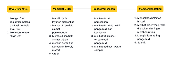
aims to know how users use the Maxim app to make a priority set for crucial things that need to be improved.
c. Competitor Analysis
is done to collect data related to Maxim’s competitors' which is useful for the improvisation. The competitors related to the Maxim app are Gojek, Grab, and InDrive. During this phase, I tried to study the strengths and weaknesses of the competitors to see opportunities to be adopted in the Maxim app.

Define
This stage aims to collect, analyze, and synthesize all of the information obtained from the empathize stage to determine the core problem or crucial problem to solve.
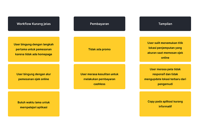
b. Affinity Diagram
This stage aims to group the problems that have been obtained into the same group. In this case study, I gained the three different groups for the problems from the empathize stage.
c. User Persona
The purpose of creating a user persona is to understand things about the user related to the product such as their profession, age, and their purposes for using a product. In this phase, I can decide to design crucial things for the user experience.

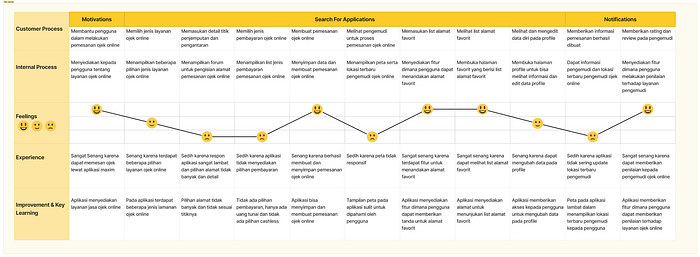
e. User Journey Map
The purpose of making a user journey map is to understand how users interact with a product and what they feel and think about their experience. This stage is useful for seeing opportunities for placing a feature so that it does not interfere with the user’s journey.
Ideate
Ideate is the stage for generating ideas. At this stage, a mind map will be created to think about the solutions offered to deal with the problems that have been collected
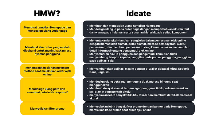
a. How Might We
is a way to turn problems into questions that aim to change our mindset that the problem can be solved. HMW is obtained from grouping several problems at the define stage.
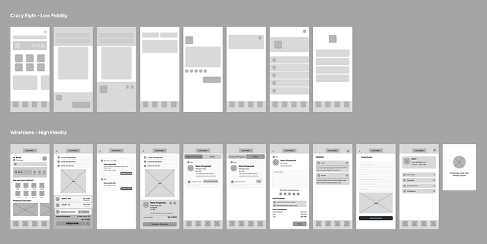
b. Crazy Eight
Crazy 8 is a method that can be used to express as many ideas as possible in a short time. This aims to express all ideas without any limitations.

c. Information Architecture
is used to compile information that will be displayed to the user. This stage is important to determine the priority level of content that needs to be shown on a page.

Prototype
a. Wireframe
At this stage, a layout of an application is first created to understand the suitability of these layouts based on their function.
b. Design System
is made after understanding the layout of a product. The design system functions as a guideline that includes several things such as color, typography, and components to make it easier when working on high-fidelity designs.

c. High-Fidelity Design
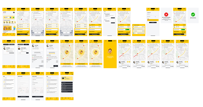
d. Prototype
Test
This stage is carried out to get feedback from users regarding the design of a product that has been created. The method used in this case study is usability testing.
a. Usability Testing
the usability testing stage is done by giving users several tasks to assess how easy it is for users to order online transportation on the Maxim application until finally, the user makes payment.
Key Information
- To understand user experience when ordering online transportation with the Maxim app
- To understand the constraints that users faced when ordering online transportation with the Maxim app
- To know user preferences about the Maxim app
Jenis Usability Testing
the type of usability testing used in this case study is unmoderated usability testing which allows me to carry out tests easily only using Maze tools.
Respondent Criteria
- user who is familiar with or has used the Maxim app
- user who is not familiar with or has not used the Maxim app
Task 1: Show us how you choose a destination when ordering an online transportation
Task 2: Show us how you can find out the voucher for your trip
Task 3: Show us how you make a payment when ordering an online transportation
Result
Based on the respondents' feedback, there are several findings I would like to explain:
- The cashless payment option and voucher features will give users ease when making an order
- The workflow is clear
- The writing is easy to read
- The voucher is hard to find
- The payment is difficult to make
Feedback 1–3 contains the advantages of Maxim’s design improvisation. However, in points 5–6, it was found that there were difficulties experienced by respondents at the payment stage.

The image above shows the order page display which caused difficulties for some respondents. The “payment method” feature looks plain without a container. This is considered less effective because it will cause difficulties for the user when pressing it, and this feature is less visible without a container. Therefore, the following changes were made:

UX Writing
Maxim has a formal brand voice so it seems stiff when compared to its competitors. Apart from that, in its Indonesian equivalent, Maxim uses language that is less friendly to users, for example: Settings / Pengaturan > parameter. This is a drawback of the Maxim app because it cannot provide human-like language. So, in this case study, the writing was improvised to make it more friendly to users.

What did I learn?
As a researcher in this case study, I have learned how to conduct a deep analysis of the problem that I want to solve to make a great improvement in the user experience. Moreover, I have tried to obtain deep information from the user about the problem they have faced.
I realized there are many things to be improved about the analysis I have done in this case study so I am very open to suggestions or constructive criticism to improve my research ability.
Thank You
